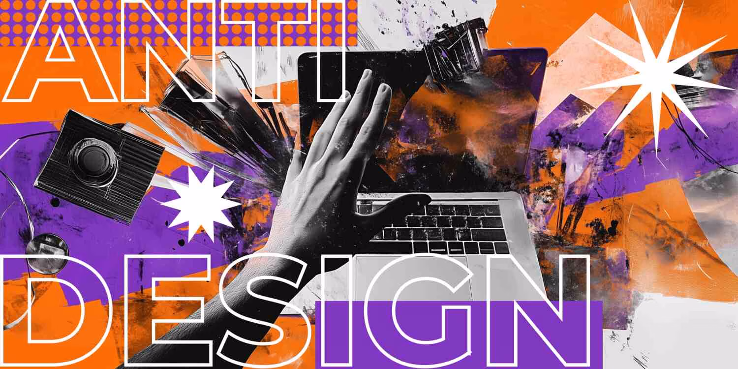
In a world dominated by polished, symmetrical, and user-friendly visual content, the emergence of anti-design is a refreshing and rebellious change. It disrupts expectations, disregards conventions, and provokes thought not by pleasing the eye, but by challenging it. Anti-design is not just a trend; it’s a philosophy that calls into question what good design is supposed to look like.
While traditional design aims to optimize clarity and beauty, anti-design embraces chaos, asymmetry, clashing colors, and disruptive layouts to deliver a different kind of message: one that prioritizes emotion, authenticity, and critique over aesthetics.
Table of Contents
What is Anti-Design?
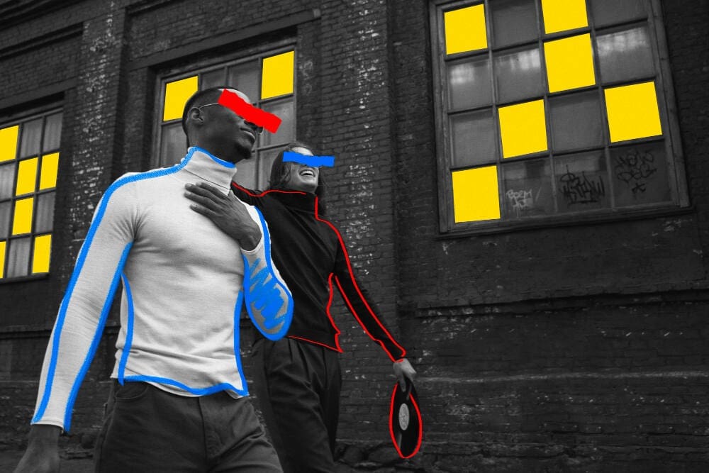
Anti-design refers to a visual approach that deliberately rejects or subverts the traditional principles of design, such as harmony, balance, readability, and simplicity. It’s messy, unrefined, sometimes confusing, and often uncomfortable. But that’s exactly the point.
Emerging as a reaction against the overly commercial and formulaic design norms, anti-design is closely tied to countercultures and subversive art movements. It echoes the spirit of Dadaism, Punk, and the DIY zine culture, which all used visual disorder as a form of resistance and self-expression.
Key Characteristics of Anti-Design:
- Clashing colors and typefaces
- Unusual or deliberately poor layouts
- Overlapping elements and chaotic composition
- Disregard for hierarchy or grid systems
- Provocative or shocking imagery
- Raw, “unfinished” aesthetics
While it may look like a mistake to some, for designers working within the anti-design framework, every decision is intentional and meant to grab attention, provoke emotion, or invite reflection.
A Short History of Anti-Design
Although the term “anti-design” may feel contemporary, the idea itself has deep roots. In the 1960s and 70s, the Italian Radical Design movement used the term anti-design to critique consumer culture and traditional aesthetics in furniture and industrial design. Groups like Superstudio and Archizoom questioned the status quo by creating intentionally impractical or absurd objects that blurred the line between design and art.
In graphic design, anti-design found early expression through punk zines, grunge posters, and underground album covers. Designers like David Carson and Neville Brody in the 1990s pushed the limits of legibility and structure in magazine layouts, challenging the idea that communication always had to be clean and easy.
Today, anti-design resurfaces in the form of brutalist websites, experimental typography, and a growing discomfort with overly polished, corporate branding. In an age of perfectionism and algorithmic design, anti-design invites human error, chaos, and emotional rawness back into the conversation.
Why Anti-Design Matters Today?
With so much visual content competing for attention, clean and minimal design often starts to blend together. From SaaS websites to Instagram templates, much of today’s visual culture follows a formula. Anti-design breaks that mold.
Here’s why it matters:
1. Standing Out in a Saturated Market
Brands and creators seeking to stand out are increasingly adopting anti-design. People pause, take a second look, and engage with its unpredictability because it deviates from their usual viewing experience.
For example, fashion brands like Vetements and Balenciaga have adopted anti-design aesthetics in their visuals and campaigns, leaning into awkward poses, garish fonts, and lo-fi styling to challenge the fashion norm.
2. Rejecting the Algorithm
Much of today’s design is guided by what performs best in metrics. Anti-design rejects the idea that success is purely quantitative. It fosters expression without optimization, templates, or filtering. It presents a design that prioritizes substance over strategy.
3. Making a Statement
Anti-design can be a tool for protest or social commentary. By rejecting visual harmony, it mirrors discomfort, chaos, or rebellion. It becomes an effective way to highlight issues like censorship, consumerism, identity, and mental health—themes that don’t always sit comfortably within the bounds of traditional design.
4. Embracing Authenticity
Perfection often feels artificial. In contrast, the rawness of anti-design can communicate authenticity — a key value for Gen Z audiences who value transparency and imperfection over the curated and commercial. This is why you’ll see anti-design aesthetics on zines, personal blogs, and even TikTok slideshows.
How to Use Anti-Design Intentionally (and When to Avoid It)
While anti-design is powerful, it’s not for every brand or message. The key is understanding when to break the rules and why.
Use it when:
- You want to express dissent, critique, or satire
- The brand or content aligns with subcultures, activism, or underground scenes
- You’re targeting a younger, visually literate audience who values innovation
- Your message benefits from emotion, irony, or a sense of the unexpected
Avoid it when:
- You need maximum clarity and accessibility (e.g., instructions, government info)
- Your audience isn’t familiar with design norms and might see it as “bad design”
Your brand depends on authority, tradition, or elegance - It feels forced or used solely for shock value
A good anti-design piece communicates in a way that’s layered, emotional, or intentionally uncomfortable.
Modern Examples of Anti-Design
- David Carson’s Ray Gun magazine: Carson famously published an interview entirely in the Zapf Dingbats typeface, making it unreadable — a literal rejection of legibility.
- Brutalist websites: These sites use raw HTML aesthetics, harsh contrasts, and minimal interactivity.
- Instagram grids and campaigns: Some brands use bizarre filters, off-center layouts, and chaotic collage styles that go against platform norms.
- Zine culture & underground posters: DIY publications and event posters still carry the anti-design legacy, combining handwritten elements, cut-and-paste collage, and jarring juxtapositions.
Criticism and Misuse of Anti-Design
As with any trend, anti-design runs the risk of becoming performative or superficial. When used without purpose, it can come off as lazy and gimmicky.
There’s also the challenge of accessibility. While anti-design works well in niche or artistic contexts, it can exclude audiences who rely on readability, visual order, or structure to process information.
We at Ginger IT believe that when a brand lets go of perfection, something more profound starts happening. Some brands find that anti-design and breaking the rules resonate deeply, particularly when they originate from a genuine place rather than a desire to conform to a trend.
Finally, as more brands co-opt anti-design to appear “authentic” or “cool,” there’s a risk of it becoming yet another marketing tool: polished rebellion wrapped in commercial intent. This paradox forces designers to be mindful: is the design genuinely disruptive, or just a new kind of packaging?
Conclusion: The Art of Breaking the Rules
Anti-design isn’t about carelessness. It’s about intentional disruption. It asks the designer to know the rules well enough to break them meaningfully. By embracing imperfection, anti-design gives us a way to question the polished facade of modern media and reconnect with raw expression.Anti-design is a reminder that graphic design is not just about visuals but about voice. Whether you’re using it to make a political statement, challenge cultural norms, or simply stand out, anti-design proves that sometimes, the most powerful design is the one that dares to be uncomfortable.

